Components
All the Angular components are made with TailwindCSS.
Themes
By default, 2 themes are enabled: light & dark. It will automatically switch based on the user's preferences.
To change or add themes:
- Add/remove themes in
tailwind.config.ts>daisyui.themes(keep at least one) - Add the theme name to the
config.tsfile intheme&mainconfig.ts
colors: {
  theme: "YOUR_THEME",
  main: themes[`[data-theme=YOUR_THEME]`]["primary"],
}
Here is a list of the 20+ available themes
Custom components
All custom-made components are inside the /components folder of your ShipAngular repo. Each component is documented in details in the code and in this documentation.
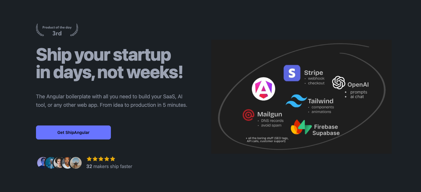
Example: This is a Hero component.

daisyUI components
ShipAngular uses daisyUI as a UI kit for simple components like buttons, inputs, tabs, etc. Here are all the daisyUI components.
Example: Add className: "btn btn-primary" to display this button:
Animations
Discover some cool animations in the config.tailwind.css file:
className: "animate-opacity"className: "animate-wiggle"className: "animate-appearFromRight"className: "animate-popup"
Custom font
1. Head over to the global styles.scss file in /src
2. Import your favorite font from next/font/google @import url('https://fonts.googleapis.com/css2?family=Bricolage+Grotesque:wght@400;700&display=swap');
3. Set it in the body selector in your styles.scss: body { font-family: 'Bricolage Grotesque', sans-serif; }