ComponentsFeatures Grid
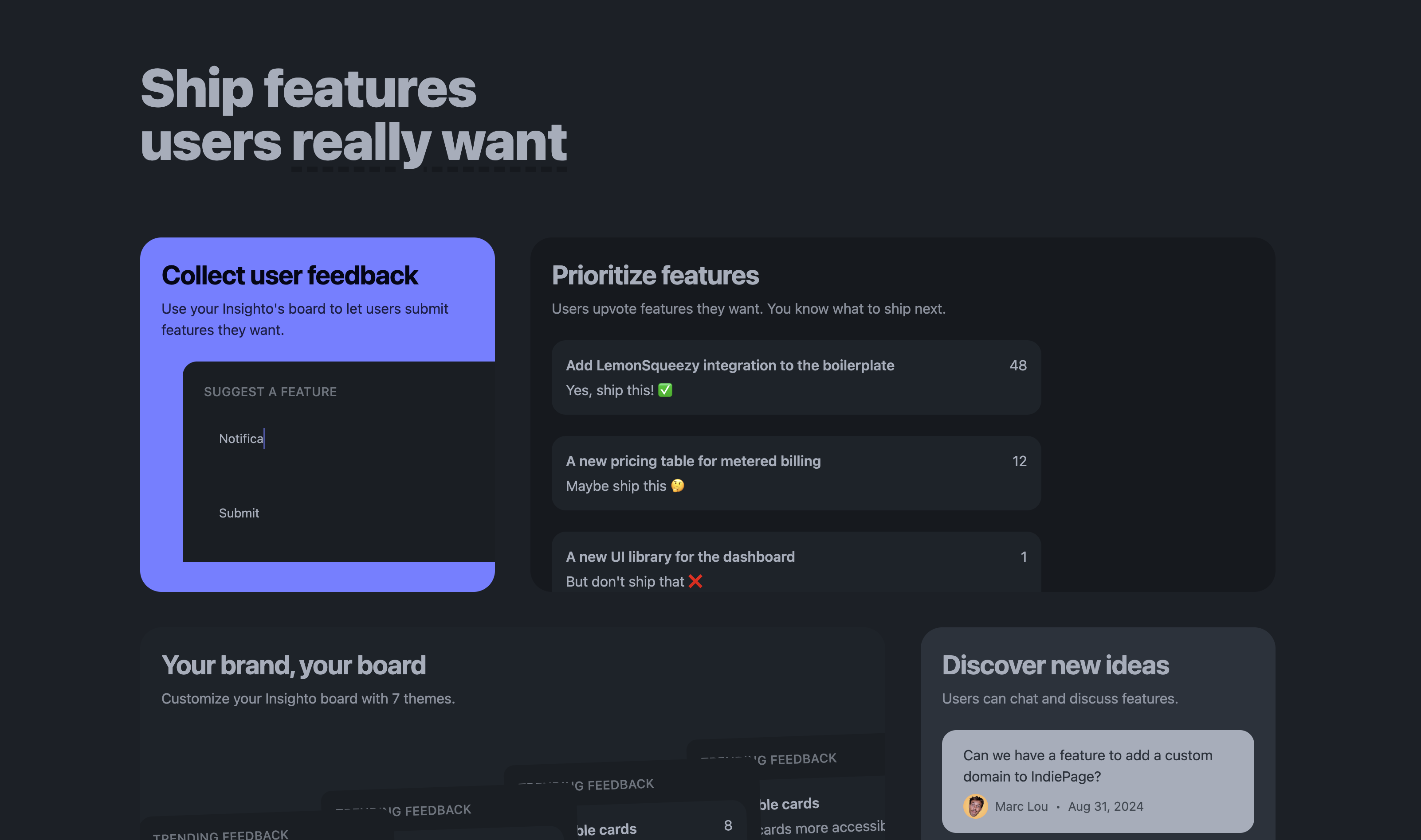
A component to display features with interactive demos in a responsive grids layout. Each feature has a title, a short description, and an interactive demo.
A component to display features with interactive demos in a responsive grids layout. Each feature has a title, a short description, and an interactive demo.

{page}.component.html
<app-features-grid />Tips
- Keep the title short and simple (less than 5 words).
- Each feature card can take upto 3 columns of width.
- The interactive demo should be a simple, yet powerful example of the feature.
- You can also display a video or an image instead of an interactive demo.
Updated on: Wednesday, May 15, 2024